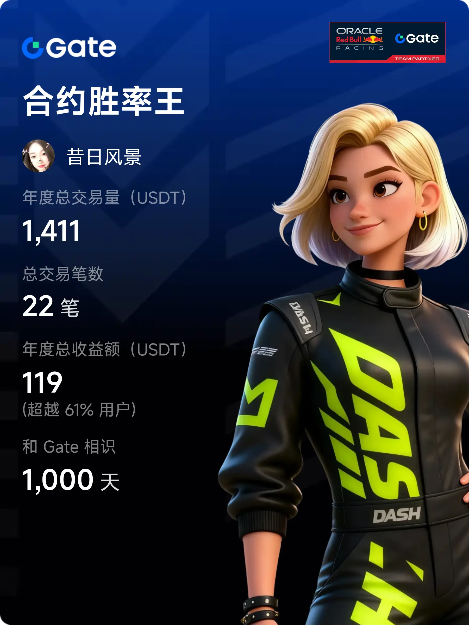


#GateAPP焕新体验
The feature that surprised me the most: the dynamic design of the market page.
In the past, I always felt that the market information was overwhelming. After this update, the visual effects and layout of the market page have been finely adjusted. The color contrast of the rise and fall in the watchlist is clearer, and key data can be captured at a glance. Especially when viewing candlestick charts, the new localized zoom response is much more intuitive, and the switching of technical indicators has become smoother. For those who are used to monitoring the market, these small opti
View OriginalThe feature that surprised me the most: the dynamic design of the market page.
In the past, I always felt that the market information was overwhelming. After this update, the visual effects and layout of the market page have been finely adjusted. The color contrast of the rise and fall in the watchlist is clearer, and key data can be captured at a glance. Especially when viewing candlestick charts, the new localized zoom response is much more intuitive, and the switching of technical indicators has become smoother. For those who are used to monitoring the market, these small opti